Ḥeshbon → Where to start
You are looking for a community you can afford
The same life costs more than twice as much in one town as in another, and the cheaper town often pays you less. These pieces price the whole bill, community by community, rather than one line of it.

Read these six first
Short, and each one answers a question you already have.
 Community affordability · 7 min read
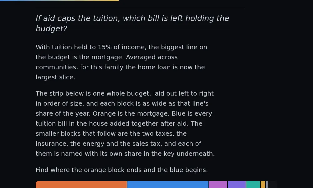
What does a year of Orthodox family life actually cost?
One household, four children, priced line by line across the map. Tuition is the largest line on the bill, ahead of the mortgage, and location moves everything.
2.3×spread in the all-in cost of the same life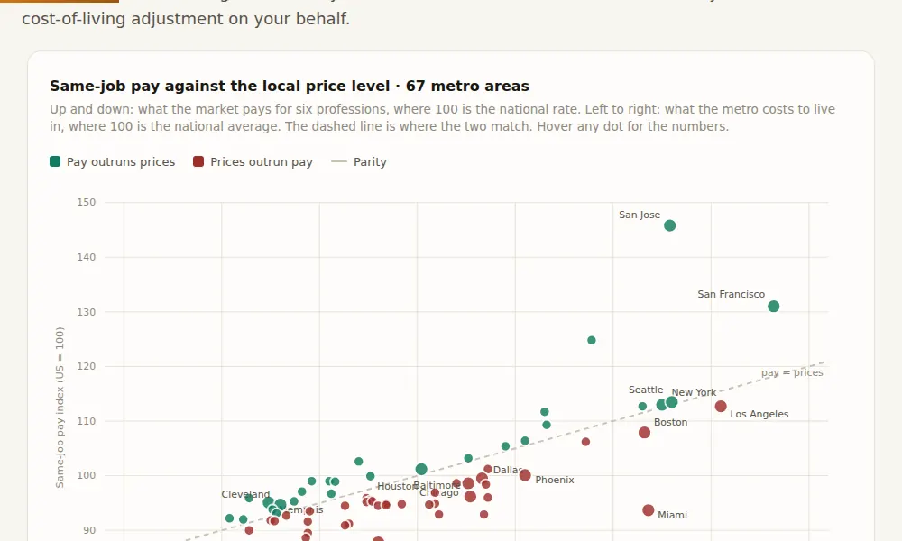 Salary · 8 min read
If a community is cheaper, does it pay you less?
Wage data for six professions in every metro in the country. The best-paying market pays about 1.8 times the worst for identical work, and cost of living eats most of the difference.
1.8×best-to-worst pay spread, before cost of living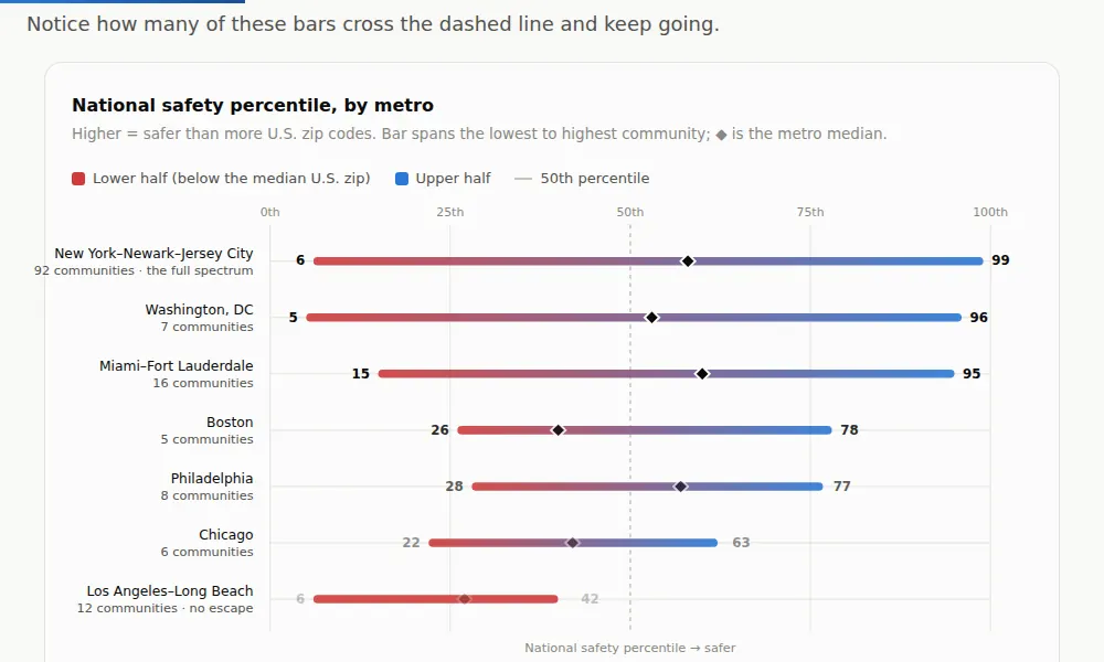 Housing · 9 min read
Does the city tell you whether the neighborhood is safe?
The city is the wrong unit for judging safety. Reputation is close to a coin flip, and the posh enclaves cluster lower than the gritty ones.
6th–99thsafety percentile range inside one metro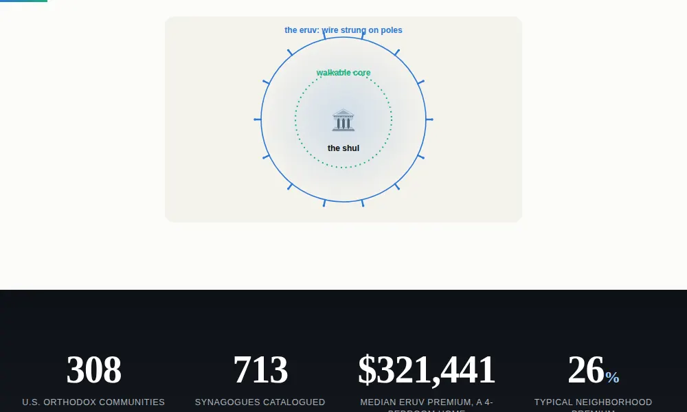 Housing · 7 min read
What does walking distance to a shul cost?
The priciest Orthodox communities turn out to be the mature ones; the fastest-growing compete on affordability. What a rising walk-to-shul premium reveals that a high one cannot.
10–20%the premium on an otherwise-identical home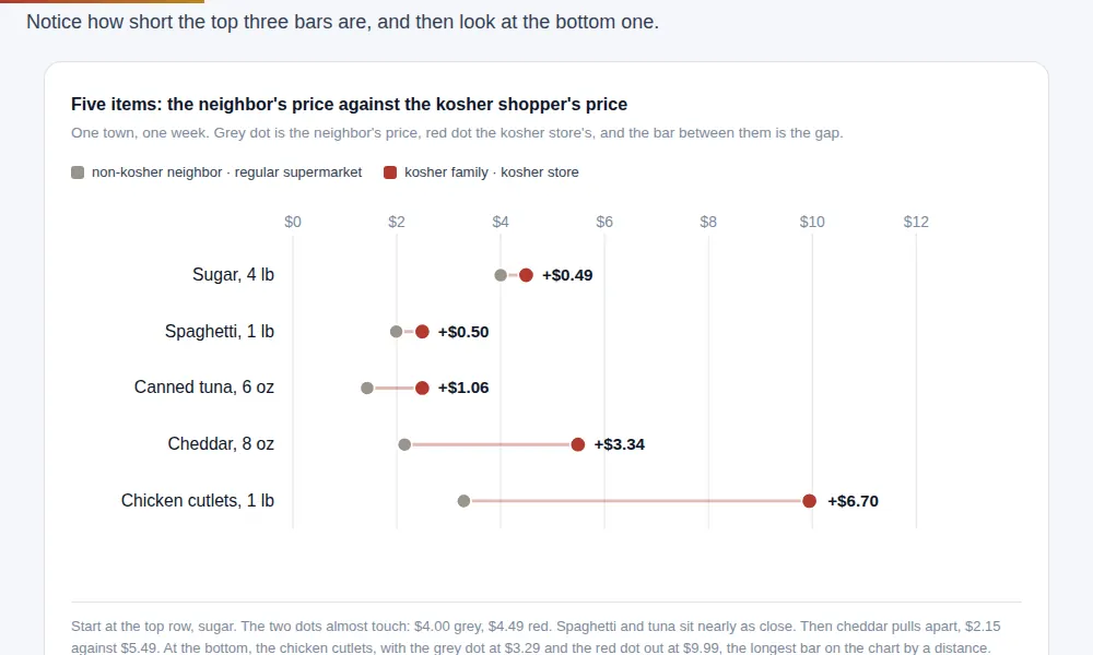 Groceries · 8 min read
How much of the kosher premium is actually about being kosher?
Across five cities, the kashrut-driven price gap barely moves. The gap driven by geography and channel swings widely, and that is the part a family can act on.
1.9×kosher staples versus the national basket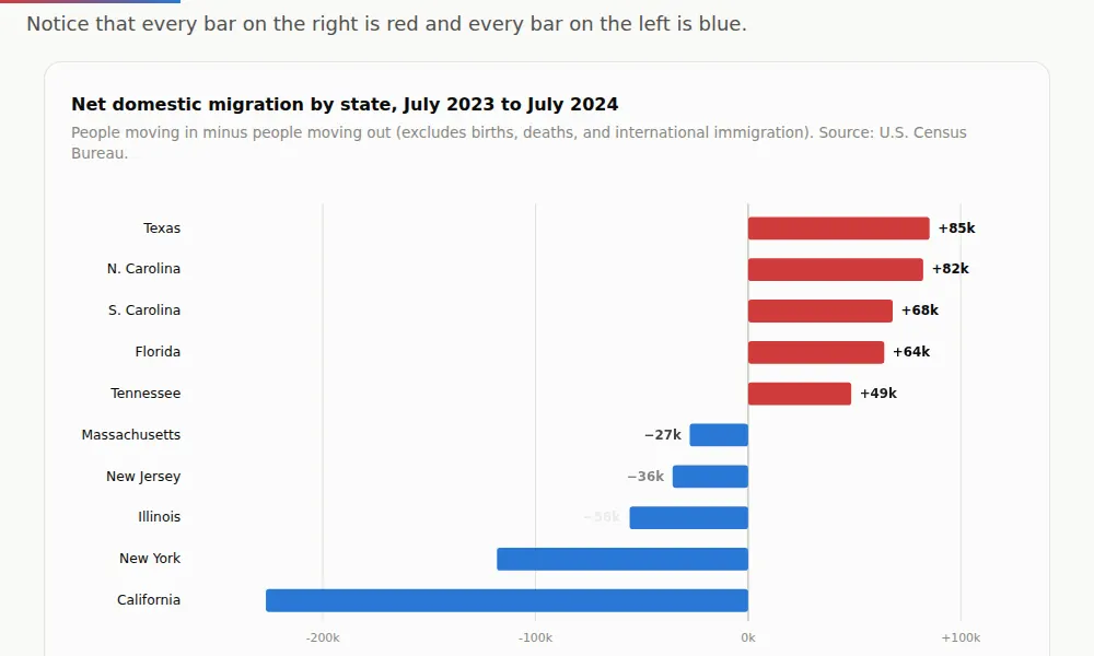 Housing · 8 min read
Is the frum world sorting by politics?
Orthodox families are said to be fleeing blue states for red ones. The community’s own data shows the story is real in exactly one place, and it runs on cost, not politics.
3:1Jewish population still in blue, high-tax statesThen the rest of it
Longer, more technical, and worth it once the shape is familiar.
- What does it cost to set a Shabbos table every week, and to fill it with guests? Research brief 6 min read
- In a large Orthodox family, which child is the expensive one? Research brief 8 min read
- Where can a divorced Orthodox couple both afford to stay? Research brief 7 min read
- When the tuition bill ends, where is the best place to grow old? Research brief 7 min read
- Day school tuition rises about 4% a year. Does it track inflation? Essay 3 min read
Put your own numbers in
These answer rather than argue.