The paper behind this story
The Kollel Dividend
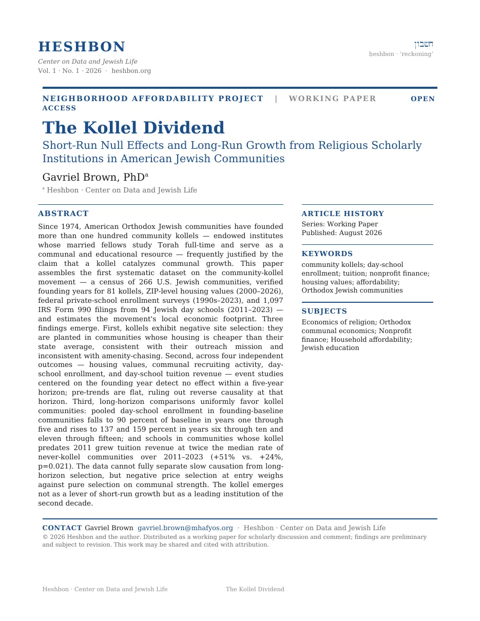
Request the full whitepaper
Tell me who you are and where you work. I’ll send the complete paper.
Sent to the author directly. No list, no forwarding, no third parties.
For fifty years, American Jewish communities have planted houses of full-time Torah study, betting that scholars would make their towns bloom. So we measured the bet across 266 communities, in home prices, classrooms, and money. It pays. Slowly.
When did American communities start planting kollels?
A community kollel is a small bet with a grand theory behind it. Bring in a handful of families, young scholars who learn Torah full-time and teach anyone who walks in, and a modest Jewish community becomes a makom Torah: a place with gravity, the theory goes, that draws families, fills schools, and lifts everything around it. The first American experiment opened in Detroit in 1974. Then the idea caught fire.
Each arch-topped bar in the chart below is one decade, and its height is how many community kollels were founded in it. The number printed above a bar is that count. Notice how far to the right the tall bars sit.
Where do the planters plant?
Not where the money is. In the chart below the vertical line is the state average home value, and each horizontal bar is one group of communities, measured in the years before any kollel arrived. A bar reaching left is a group that is cheaper than its state. A bar reaching right is more expensive.
Notice which direction the two kollel bars point.
When a kollel arrives, do home values move?
If a kollel makes a community a destination, demand should show up in home values. So we lined up every kollel founded between 2003 and 2020 against ZIP-level home prices, with 145 never-kollel communities as controls, and asked what happens when the kollel arrives.
Each dot in the chart below is one year, running from six or more years before the founding on the left to six or more after on the right. A dot's height is how home values in kollel communities moved that year against the controls, measured from the year just before founding. The horizontal line across the middle is zero, meaning no difference. The vertical line running through each dot is the range the estimate could plausibly take, so a long line means an uncertain year. The red dashed line is the moment the kollel opens.
Look at where the dots sit relative to the flat line at zero.
Nothing, in either direction. Kollels do not chase rising markets, and they do not create them. Five years after the scholars arrive, the neighborhood is worth exactly what it was always going to be worth.
And does the money move?
The next chart reads the same way, one dot per year with its range hanging through it, only now the height is day-school tuition revenue from IRS filings rather than home values. Watch the ranges here: they are much longer, because eight schools cannot pin a number down tightly.
By every five-year measure, the bet fails.
The mistake is the five years.
If home prices can't see the community, what can?
Home prices average over everyone in a ZIP code, and in these towns the frum community is a sliver of the whole. The truer census of a growing community is its day school. We reconstructed enrollment histories across the kollel communities from federal school surveys, state education censuses, and archived records, then pooled them on a single clock: years since the kollel's founding.
Each dot in the chart below is one window of years on that clock. The horizontal rule marked 100 is the founding-era enrollment level, so a dot above the rule means the school is larger than it was at founding and a dot below means smaller. The stem hanging between the rule and each dot is the size of that gap, red when enrollment drops and blue when it climbs.
Follow the four dots from left to right.
A dip, then a climb. In the first five years the median community's school is smaller than it was at founding, because the scholars have arrived but their students haven't yet married, settled, and enrolled children. By the sixth through tenth year the median is a third above baseline. By the fifteenth, sixty percent above.
Does every kollel community grow?
No, and that deserves saying plainly. Each small arch in the chart below is one kollel community's day-school trajectory over the last decade. Blue arches grew by more than 10%, gray arches held flat, red arches declined by more than 10%, and the big number under each group is how many.
Count the red arches before you read the blue ones.
What happens when you compare whole decades instead of five-year windows?
The 990s carry thirteen years of audited filings, which is long enough to try. Take every day school in a community whose kollel is old, planted before 2011 and many of them decades before, and set it against schools in communities that never had one. Same years, same economy, same inflation. In the chart below each column is one of those two groups, and its height is the median growth in tuition revenue from the early 2010s to the early 2020s.
Look at the bracket joining the two columns.
Founding a kollel does nothing you can measure in five years,
and everything you can measure in twenty.
So is the kollel causing the growth, or choosing it?
Two explanations fit, and the data cannot fully pry them apart. Perhaps kollels simply chose well, decades ago, planting themselves in communities destined to grow. Or perhaps the mechanism is real but slow: a few scholar families arrive, their students marry and stay, their children fill kindergartens, and only a decade later does any spreadsheet notice.
One fact leans toward the slow mechanism. Go back to the second chart in this essay, the one with the bars pointing left: kollels are planted in communities cheaper than their states, not in obvious winners. Either way, the practical reading is the same for a family, a philanthropist, or a community weighing the decision.
So: does planting a kollel make a community grow? Not for a decade, and then yes. A kollel is not a purchase of growth. It is a bet on a community's second decade, and the communities that made that bet twenty years ago are, today, the ones growing twice as fast.
The paper behind this story
Tell me who you are and where you work. I’ll send the complete paper.
Sent to the author directly. No list, no forwarding, no third parties.