The paper behind this story
The Red Push
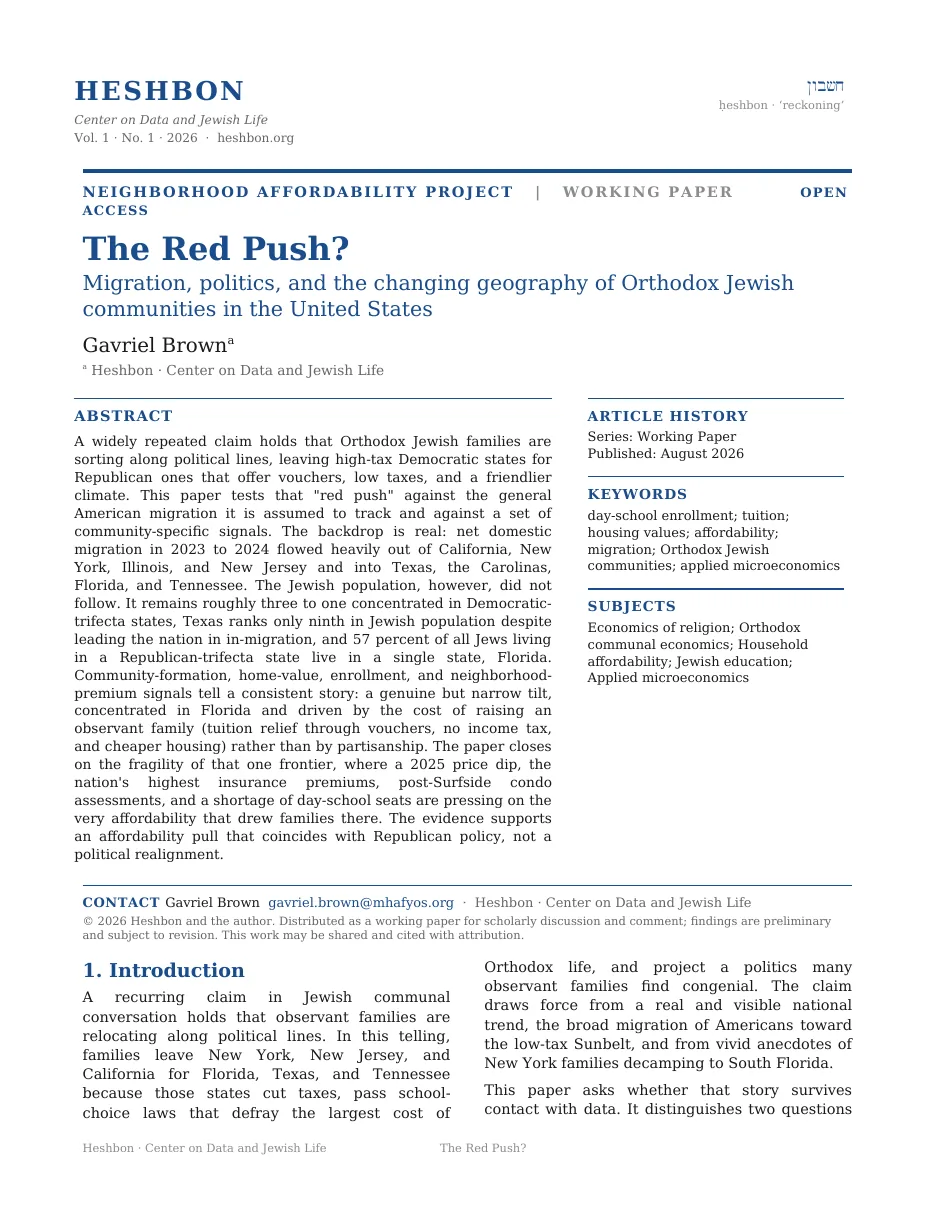
Request the full whitepaper
Tell me who you are and where you work. I’ll send the complete paper.
Sent to the author directly. No list, no forwarding, no third parties.
America is moving to red, low-tax states, and the talk is that Orthodox families are riding the same wave. So we put the community's own numbers beside the migration data: state populations, new institutions, day-school rolls, and block-level home prices. The answer is narrower and stranger.
There is a "red push" story. It is real in exactly one place, and it runs on cost, not on politics.
The backdrop is not in dispute. Americans are leaving high-tax blue states and pouring into the low-tax Sunbelt. In a single year, Texas and Florida gained hundreds of thousands between them while California and New York shed even more.
But the Jewish community did not follow the crowd. Its population still sits about three to one in blue, high-tax states. Texas, the number-one magnet for Americans overall, holds a modest Jewish population. If observant families were simply chasing red politics, Texas would be a boomtown for them. It is not.
Florida is the exception, and it is a big one. It is the third-largest Jewish community in the country, it is red, low-tax, and voucher-rich, and it is where nearly all of the community's genuine new growth is landing. Strip Florida out, and the red-state Jewish population barely registers.
The question isn't whether frum families are moving to red states. It's whether they're moving for red politics, or for a cheaper place to raise a family that happens to be red.
Where did Americans actually move?
Start with everyone, not just Jews. The chart below shows net domestic migration for the twelve months to July 2024, meaning the people who moved into a state minus the people who moved out. Each bar is one state. The darker vertical line down the middle is zero. Bars pointing right are states that gained people, bars pointing left are states that lost them, and the length of a bar is how many. Bar color is the state's 2026 government: red for a Republican trifecta, blue for a Democratic one.
Notice that every bar on the right is red and every bar on the left is blue.
Did the Jewish map move with them?
If the community were sorting by politics, its map would be sliding toward the states drawn in red above. Each bar in the next chart is one state, and its length is how many Jews live there, running from zero at the left. The colors carry the same meaning as before: red for a Republican trifecta, blue for Democratic, amber for a divided government.
Look at the color of the two longest bars.
If any city should be a frum boomtown, it is Austin: the poster child of the red-state, low-tax, tech-driven migration, drawing Americans by the hundreds of thousands. Yet Texas as a whole holds about 221,000 Jews, ninth in the country, behind states a fraction its size in general growth.
Austin's own Jewish community runs perhaps 15,000 to 18,000, its Orthodox core smaller still, its flagship Orthodox shul counted in the dozens of member families. It has an eruv, a mikvah, and kosher shelves at H-E-B, but as of the community's own recruiting push it still lacks a mainstream Orthodox day school, the single thing families with children need most. The general migration wave rolled straight through Austin. The observant community mostly did not follow.
Take Florida out of the picture, and there is almost no red-state Jewish community to speak of. The "red push" is, mostly, a Florida story.
If the population map is slow, where are new communities actually forming?
New institutions are a faster read than population counts, and a community kollel, which needs enough committed families to fund full-time study, is one such marker. Founding a new one is a bet that a community has arrived. Each bar below is a state, its length is how many new kollels opened there since 2015, and the colors are the trifecta colors again. Hover a bar and it names the communities.
Find the first red bar.
Where the community does go red, what is it following?
The two great fixed costs of Orthodox life are tuition and housing, together about three-quarters of an all-in budget, and tuition is the single largest line. A universal school voucher strikes straight at that master cost, and the absence of a state income tax adds a further margin. The red states drawing frum families are precisely the ones that lower both.
Each column below is one state, and its height is how much a typical home there gained in value between 2015 and 2025. The dashed line running across the chart is the national figure, +89%, so a column rising above the line is a state where housing demand ran hotter than the country's. Watch where that dashed line cuts across the columns.
Do the community's own closer gauges show a political sort?
Two measures sit closer to observant families than a state population count does. The first is the population of the schools. Each bar below is one community's day-school enrollment change since 2016. The vertical line down the middle is zero, no change. Bars run left for communities that shrank and right for those that grew, the colors are the trifecta colors again, and a faded bar marked with an asterisk is a pluralist rather than Orthodox school.
Read down the bars and notice that red and blue appear at both ends.
The second measure is sharper. For each Orthodox neighborhood, compare its home prices to a nearby non-Jewish neighborhood. A ratio below 1.0 means the frum blocks are cheaper than their surroundings; above 1.0 means buyers are paying a premium to live inside the eruv, walking distance to shul. When that ratio climbs past 1.0, observant demand is actively bidding the neighborhood up. Over ten years, only three neighborhoods made that crossing.
Each row below is one of them. The hollow gray circle is where the ratio started and the filled blue circle is where it ended, with the bar between them showing the move. The dashed vertical line is parity, 1.0, the point where the frum blocks cost exactly what the comparison neighborhood costs. Anything left of that line is a discount and anything right of it is a premium.
Watch all three blue circles cross the dashed line.
So which of the two stories is it?
Something is clearly happening. The two candidate explanations predict almost the same handful of headlines, so the way to separate them is to ask what else each one would have to be true.
Would predict the Jewish map sliding red across the board, blue communities hollowing out, and Texas, the top national magnet, booming for observant families.
But: the Jewish population is still 3-to-1 blue, New Jersey and New York remain the largest builders, the great Torah centers have not moved, and Texas stays a minor Jewish community.
Would predict growth concentrated where tuition and taxes are lowest, one dominant destination that offers both plus an established base, and no broad drift.
And: that destination is Florida, the cheapest frum communities cluster in voucher and no-tax states, and the general Sunbelt migration the community rides is itself cost-driven.
The honest reading is the second one. There is a red push, but it is small, concentrated in Florida, and economic at its root. Red-state policy matters enormously here, as the price of tuition and the size of a tax bill, not as a flag. That is why the general red-migration wave and the frum community only overlap in the one state that also happens to be an established Jewish center.
If it all rests on Florida, how solid is Florida?
The affordability that pulled families to Florida is the very thing now under strain, and the housing data shows it first. The line below is the typical Florida home value, one point per year from 2015 to 2025, with higher meaning more expensive. The dot near the end marks the peak, and the dot after it marks where the following year landed.
Follow the line up, then watch the last segment.
Florida carries the highest home-insurance premiums in the country. After a 2022–24 crisis in which insurers fled and rates jumped by double digits, 2026 brought some relief, but coverage stays costly and hurricane-exposed. A voucher can cut tuition; it cannot cut a wind policy.
After the 2021 Surfside collapse, state law now forces older condos to fully fund structural reserves and pass milestone inspections. The resulting special assessments and fee jumps land squarely on the South Florida condo belts, Surfside, Miami Beach, Aventura, where many Orthodox families live.
Florida's Jewish schools were already near 87% capacity, with Orthodox enrollment up over 150% in fifteen years. New schools stay small, and a 400-seat building runs $10M-plus to build. Growth is outrunning the classrooms, and a family without a school seat is a family that cannot move.
So: is the frum world sorting by politics?
Barely, and only in one state. It is sorting by cost, and cost happens to be lowest where the politics are red.
The wider American migration into low-tax red states is real, and the community rides a sliver of it. But its center of gravity has not moved: the population, the largest builders, and the block-level demand all still sit in the blue metros of New York, New Jersey, and Maryland. The one true frontier is Florida, which offers what actually moves observant families, cheaper homes, no income tax, and vouchers that cut the tuition bill. Whether that stays true is the open question, because insurance, condo assessments, and a shortage of classroom seats are all pushing back on exactly the affordability that made the bet work. Call it a red push if you like, but it is a push toward a spreadsheet, and in Florida that spreadsheet is getting harder to balance.
The population figures are total Jewish population by state (Sheskin & Dashefsky, American Jewish Year Book 2024), not Orthodox-specific; no reliable state-by-state Orthodox count exists. The observant community is younger, higher-fertility, and more geographically concentrated, so its own trends can run ahead of the totals. That is exactly why the essay layers frum-specific signals, new institutions, day-school enrollment, and eruv demand, on top of the population backdrop.
Net domestic migration (Census, July 2023–July 2024) counts people moving between states, not international immigration. It describes all Americans, not Jews specifically, and is used here as the general wave the community may or may not be riding. A single year also understates and overstates: 2024's flows are far smaller than the 2021–22 pandemic peak.
The kollel-founding count is one marker of new-community formation, not a census; 80 of ~115 kollel communities have a reliable founding year, and the largest Torah centers (Lakewood, Brooklyn, Baltimore, Monsey, Los Angeles) are undatable anchors, all in blue states. Day-school enrollment is a 16-community sample from 2016 on, so it reads recent trajectory, not the founding era. The eruv-premium test misses communities that are whole municipalities (Teaneck, the Five Towns, Lakewood) rather than named neighborhoods.
The states that are Republican, offer universal vouchers, and levy no income tax are largely one set, so no cross-sectional comparison can fully separate a political effect from an affordability one. State political and policy status is measured as of 2026 (23 Republican trifectas, 16 Democratic, 11 divided; the November 2025 elections kept New Jersey and Virginia blue) and applied across the period.
Zillow's state index is all-population and all-housing, not frum-specific, so it captures the broad Sunbelt housing demand the community is embedded in rather than observant demand in isolation. Texas is the caution: red, no-tax, and voucher-providing, yet its home values grew a below-average 80%.
The insurance point reflects Florida's 2022–24 crisis (double-digit rate hikes, insurer exits); by late 2025 and 2026, regulators and Citizens announced some rate relief, so the picture is easing at the margin even as Florida remains the most expensive and hurricane-exposed state to insure. The condo pressure comes from post-Surfside law (SB 4-D 2022; HB 913 2025) mandating structural reserve studies and milestone inspections, with a December 2025 reserve deadline. The school-capacity figures (~87% full; Orthodox enrollment up 150%+ over 2007–2023) come from a Teach Coalition analysis of Florida Jewish schools. The 2025 home-value dip is from the same Zillow series used throughout.
The paper behind this story
Tell me who you are and where you work. I’ll send the complete paper.
Sent to the author directly. No list, no forwarding, no third parties.