The paper behind this story
The Portable Paycheck
Request the full whitepaper
Tell me who you are and where you work. I’ll send the complete paper.
Sent to the author directly. No list, no forwarding, no third parties.
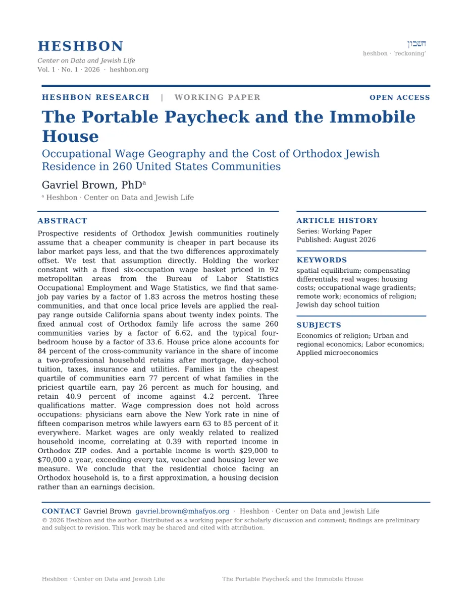
Every map in this project so far has assumed a family earns the same money wherever it lives, which leaves one obvious objection unanswered. Maybe a cheaper community is cheaper because the jobs there pay less, and a family that moves is only trading one number for another. So we went and got the wage data for six professions in every metro in the country.
Take six professions and look up what each one is paid in every metro area in the country. The whole nation fits into a surprisingly narrow band. The best-paying market pays about 1.8 times the worst for identical work, and once you account for the fact that things cost more in expensive places, the range outside California is roughly twenty points. Move an Orthodox family from New York to Cleveland and most of the paycheck comes along.
Almost nothing else does. A typical four-bedroom house in these communities costs anywhere from $154,585 to $5.2 million. That is a spread of 33.6 times against a pay spread of less than two. When you line the communities up, the price of the house by itself predicts 84% of how much money a family has left over at the end of the year.
So the gap is not close. Look at the cheapest quarter of Orthodox communities in the country and a couple, one an accountant and one a nurse, keeps 41% of what it earns after the mortgage, the tuition, the taxes and the insurance. In the priciest quarter that same couple keeps 4%. They earn about three quarters as much. They pay about a quarter as much for the house.
How much does the same job actually pay in a different city?
Start with the wage side, because that is the part nobody has measured here before. We took six occupations, physicians and lawyers and accountants and pharmacists and civil engineers and nurses, and looked up what each is paid in every metro area with an Orthodox community in it. Then we compared each metro to the national rate for that same job. A score of 120 means the market there pays 20% above the national rate to do exactly the same work.
The chart below plots that wage score against how expensive the metro is to live in. Each dot is one metro area. The dashed line running up the middle is where the two are equal, so a dot sitting on the line means pay and prices are in balance. Dots above the line are places where the market pays more than the local cost of living demands. Dots below it are places where it pays less.
Notice how close to the line almost everything sits. The statistical relationship is 0.78, which for anyone who does not work with correlations is very tight. A few metros sit well off the line, and those turn out to matter, but the first thing to take away is that the American labor market has already done most of the cost-of-living adjustment on your behalf.
For the same person doing the same job, where does a year of work buy the most?
Divide one number by the other and you get what economists call real pay: not what the paycheck says, but what it buys. It answers one question. For the same person doing the same job, where does a year of work go furthest?
The honest answer is that it barely matters where you go. In the chart below, green bars are metros where a year of work buys more than average and red bars are metros where it buys less. The center line is the national average. Set California aside and every metro in the country with an Orthodox community in it sits inside a twenty-point band.
Miami is worth stopping on, because it overturns something this project has said before. Florida has always scored well in these rankings, for two reasons that are both still true: the state takes no income tax, and it hands out a school voucher to everyone. Those are real advantages. They were also both measured against a salary we assumed did not change.
So it is worth adding up what Florida actually hands this family, because it is real money. Taking no state income tax saves about $6,700 a year on a Miami salary, measured against what New Jersey would take on the same income. The state scholarship pays $8,745 for a child in kindergarten through third grade, $8,140 for grades four to eight and $7,942 for high school, which comes to $24,827 for the three school-age children in our household. Call the package $31,600.
Now set that against the wage gap. The same two people doing the same two jobs earn about $53,000 less in Miami than in the New York metro. Florida gives back roughly six dollars for every ten its labor market takes away, which is a lot and is not enough.
The voucher is left out of every cost figure in this essay, so that states without one can be compared fairly. Counted back in, it moves Boca Raton from $15,706 of annual surplus to $40,533, and North Miami Beach from $39,715 to $64,542. It does not rescue Miami Beach, which still misses by $135,566.
Florida hands this family about $31,600 a year. Its labor market takes about $53,000 back.
If the paycheck barely moves from place to place, what does?
Here is where the argument turns. If pay is roughly flat once you adjust for prices, then whatever is separating these communities has to sit on the spending side. It does, and it is overwhelmingly one line on the family budget.
A typical four-bedroom house runs $154,585 in Youngstown and $5.2 million in Beverly Hills. Set that 33.6 times spread next to the 1.8 times spread in wages and you can already see which one is doing the work.
To show it, we sorted all 260 communities by what a house costs and cut them into four equal groups. The chart below gives each group one bar, and each bar is one dollar of what the family earns. The orange part is what the fixed costs take: the mortgage, the tuition, the taxes, the insurance, the utility bills. The green part is what is left. Watch the green shrink as you move down.
That could be an artifact of grouping, so here is every community on its own. Each dot below is one Orthodox community. Its position left to right is what a four-bedroom house costs there, and its position up and down is the share of income the family has left at the end of the year. The horizontal line across the middle is zero, the point where a family's fixed costs eat everything it earns.
The dots fall in a line, and they fall hard. House price on its own accounts for 84% of the variation. Nothing else in this dataset comes close: not the state income tax, not the voucher, not the local wage.
The choice of where to raise an Orthodox family looks like an income question. It is a housing question.
After the mortgage, the tuition and the taxes, what does a family actually have left?
To keep this concrete, we built one family and moved them around the country. Two working parents, four children in day school, a four-bedroom house with a mortgage at this month's rate. Their income is not a guess. It is whatever an accountant earns in that metro plus whatever a nurse earns in that metro, which nationally comes to $181,230 and rises or falls with the local market. Their costs are local too, right down to the state income tax on the salary they actually make there.
One filter before the results. A community without an Orthodox high school is not really an option for a family with four children, because it means sending a fourteen-year-old to board somewhere else. So this chart, and everything after it, is restricted to the 71 communities that have one.
Subtract the mortgage, the tuition, the taxes, the insurance and the utility bills, and what is left is the number below. Green means money left over. Red means the family cannot cover its fixed costs at all. Before you read the names, notice that every community at the top has cheap housing, and not one of them sits in a strong labor market.
Does that mean any cheaper community will do?
None of this means that packing up and leaving works. It depends enormously on where you land, and most of the places Orthodox families actually move to are not cheap.
Take Teaneck as the starting point, because it is already a decent deal by New York standards, with a family keeping 31% of its income against 20% in the median big-metro community. Send that family to the destinations people most often name and the arithmetic is discouraging. Dallas cuts their costs by $21,169 and their pay by $41,330, so they end the year $20,161 short. Denver, Atlanta, Baltimore, Columbus and Pittsburgh all fail the same way. They are expensive places that pay middling wages, and across nine such destinations the pay cut swallows a median of 121% of the saving.
Now do it again against communities that are genuinely cheap. Two rules for this second list. Every one of them has an Orthodox high school, so a family is not committing to board a fourteen-year-old out of town. And every one of them beats Teaneck for a two-professional couple. In the chart below, green is how far the annual costs fall and orange is how far the paycheck falls. The black dot is the difference, which is what the family gains over a year.
Out of town is not one place. Youngstown and Dallas are three hundred thousand dollars apart on the only number that decides this.
Does the answer change depending on what you do for a living?
Everything so far has been an average, and the average hides the single most useful fact in this data. How much a move costs you depends enormously on what you do for a living.
Some professions are priced nationally. A pharmacist earns roughly the same money in Cleveland as in Manhattan. Others are priced by the size of the local market, and law is the extreme case: a lawyer gives up a third of their income at the state line, and it makes almost no difference which line. Medicine does something stranger, which is to pay more in exactly the places where everything else pays less.
The grid below has one row for each profession and one column for each of fifteen metro areas, all of which have an Orthodox high school. Every cell is what that city pays for that job as a share of the New York rate. Green cells pay more than New York, red cells pay less, and pale cells are roughly a wash. Read across a row to see how much a profession loses by leaving. Read down a column to see what any one city does.
Now go back and read the Teaneck chart through this one. Cleveland Heights was worth $9,359 a year to our accountant and nurse. For a pharmacist married to a civil engineer it is worth far more, because their salaries barely move and nearly the whole $70,789 saving stays in their pocket. For a physician it is the best deal anywhere in this data, a raise and a $70,789 cost cut in the same decision. For a litigator it is a large pay cut bought with a smaller one.
Does what the market pays tell you what your neighbors actually earn?
One caution before you take any of this home. Everything above measures what an employer will pay. It says nothing about what Orthodox families actually bring in, and the two turn out to be only loosely connected. Across the country, the link between what a metro pays and what its Orthodox neighborhoods report earning is just 0.39, which is weak.
The clearest way to see it is to hold geography completely still. Every community in the chart below sits inside the same metro area, New York and northern New Jersey. Every one of them faces the same wage index of 113.0, among the highest in the country. The dashed vertical line is what that market pays two professionals: $225,370. Each bar is what households in that neighborhood actually report to the Census.
None of that gap has anything to do with geography. It comes from who works and for how many hours, what they do, years spent in kollel, how many people are in the house, and a large self-employed sector the Census struggles to see. The practical lesson is narrow. The wage index tells you what a community could pay a given professional. It tells you almost nothing about what the family down the block actually brings home.
And what if you did not have to take the pay cut at all?
Everything to this point has assumed that a family earns whatever the local market pays. That was true for almost everyone until a few years ago and it is no longer true for a lot of people. So here is the last scenario, and it is the one that a growing number of families can actually choose.
Suppose the breadwinner works remotely for a New York employer and keeps the New York salary of $225,370, but pays another community's mortgage, tuition and taxes. Nothing else in the model changes. The comparison below is between two versions of the same family in the same house: one earning what that town pays, and one earning what New York pays.
The size of this is worth stating plainly. A portable income is worth between $29,000 and $70,000 a year to this family depending on where they land, which is larger than any tax break, any voucher and any wage difference anywhere else in this project. Across the 71 communities with a high school, 42 of them beat staying in Teaneck once the salary travels, against 21 when it does not.
It also cuts the other way. Take the remote job away and every one of these communities falls back to its pale bar, which for Memphis, Pittsburgh and St. Louis means back below Teaneck. Whether the breadwinner's work is tied to a place has become the most consequential financial fact about where an Orthodox family lives, and it is the one variable in this entire analysis that a family can sometimes change without moving at all.
So: if a community is cheaper, does it pay you less?
A little less, and not nearly enough to change the answer. The worry we set out to test, that a cheaper community would pay you proportionally less, turns out to be mostly unfounded. Pay varies by less than two to one across the entire country, and by about twenty points once you adjust for what things cost. The house varies by thirty-three to one. The house decides.
Buy the cheapest housing you can live with. This is worth more than every tax break, voucher and wage difference in this project put together. The cheapest quarter of communities leaves a family 41% of its income. The priciest leaves 4%.
Do not assume out of town means cheap. Dallas, Denver, Atlanta and Nashville are expensive places that pay middling wages, and a family leaving Teaneck for any of them ends the year behind. Milwaukee, Cincinnati, Waterbury, Las Vegas and Northeast Philadelphia are an entirely different proposition, and they are the ones nobody talks about.
Check for a high school before anything else. Eighteen of the ninety communities here have no Orthodox high school, which means boarding a child out at fourteen and paying for it. Youngstown, Toledo, Harrisburg, Indianapolis, Nashville, Charlotte, Tucson and Portland all score well on cost and fail on this. It is the one filter that should come before the arithmetic rather than after it.
Look up your own profession before you look at anything else. Medicine pays more out of town, 114% of the New York rate in Cleveland and 131% in Memphis. Pharmacy and civil engineering hold 90 to 100 percent of their value anywhere. Law holds about two thirds, and that is the one case where the pay cut is big enough to decide the question by itself.
A move inside your own job market beats a move across the country. Brooklyn to Lakewood is worth $43,998 a year and costs nothing in salary. Manhattan to New Jersey and Los Angeles to the Valley work the same way.
And if the income travels, the question is close to settled. Keeping a New York salary while paying Cleveland's costs is worth $59,742 a year. Youngstown's, $71,595. That is more than any other lever in this project, and it is available to more families every year than it was five years ago.
A fixed basket of six occupations is priced in each metro: physicians, lawyers, accountants and auditors, pharmacists, civil engineers and registered nurses. Five are taken at the metro median. Physicians are taken at the 80th percentile, for the reason set out below. Each metro figure is divided by the national figure for the same occupation and the same statistic, and the six ratios are combined as an unweighted geometric mean. Source is the BLS Occupational Employment and Wage Statistics, May 2025. Because BLS does not publish occupation wages below the metropolitan level, every community in a metro shares one index value: Brooklyn, Lakewood, Teaneck, Monsey and Deal all read 113.0. Real within-metro variation exists and is invisible here.
The BLS code "Physicians, all other" has a median that spans 6.5 times across metros, from $68,220 in Detroit to $442,790 in Portland, Maine. Both figures are genuine May 2025 estimates, confirmed against two independent republishers. Both are artifacts. Trainees are classified with the occupation they are training for, so teaching hospitals report their residents into that residual code, and its metro median measures the local ratio of residents to attendings rather than what a doctor is paid. Detroit makes it plain: the 10th, 25th and 50th percentiles all sit inside a $5,000 band at stipend level while the 75th is $211,370. Taking the 80th percentile instead, interpolated between the published 75th and 90th, lifts the measurement above the trainee mass. The cross-metro spread falls from 6.5 times to 2.2 times, in line with the other five occupations, and the composite index barely moves (its correlation with the local price level goes from 0.788 to 0.784). Detroit is the one metro where the correction is incomplete, at 65% of the New York figure, because its resident share is large enough to reach into the 80th percentile. Teachers and financial managers were removed from the basket at the author's direction; BLS reports public-school wages for teachers, which are a poor guide to day-school pay in any case.
Each of the ninety flagship communities is marked full, partial or none. Full means boys' and girls' options, or a substantial co-ed Jewish high school. Partial means single-sex only, very small, pluralistic rather than Orthodox, or a daily commute to a neighbouring community: New Haven and Waterbury are boys only, Providence is girls only, Albany has a handful of teenagers in a PK-12 school, and Overland Park's is a pluralistic community school. None means no Jewish high school at all. The marks come from the institution names in the communities database, corrected by a web audit of thirty borderline cases, because the database misses several schools that plainly exist. Anyone using this for a real decision should confirm the current grades offered directly with the school, since small programs open and close.
Two working parents, four children in day school (one early childhood, two elementary, one high school), a four-bedroom home financed at 6.69% on 80% loan-to-value, which was the Freddie Mac survey average on 6 August 2026. Cost is mortgage principal and interest, tuition net of a flat 15% aid discount, state income tax on the household's actual local income, property tax, homeowners and auto insurance, energy and sales tax. Vouchers and ESAs are excluded from the headline figures for cross-state comparability, and quoted separately where they matter. Florida's amounts are the published 2026-27 Miami-Dade schedule; other states use a flat $7,000 per school-age child, which understates Florida by about $3,800 and should be replaced with each state's own schedule before any state-by-state voucher comparison is made. The single change from earlier models in this project is that income tax is levied on local income rather than on a fixed $250,000, and that change drives most of the reordering.
Elementary tuition is modeled as $16,000 scaled by the local price level to the power of 1.5. The exponent was checked against the 39 communities that self-report a tuition band, which imply 1.58. The anchor sits below the roughly $23,000 all-grades national average reported by Prizmah, as it should, since that average includes high school. Tuition is about 40% of the all-in cost and is estimated rather than observed for most communities, so it remains the largest source of uncertainty in the cost side, exactly as in the earlier work.
Census figures describe everyone in a ZIP code. In Lakewood, Boro Park, Monsey, Passaic and Kiryas Joel the Orthodox share is high enough that the figure is a reasonable proxy, and those are marked. Elsewhere the Orthodox households are a minority and the number describes the neighborhood instead. Williamsburg is the clearest case: its ZIP includes a large gentrified population and its median tells you little about the Hasidic families in it. Five suburban ZIPs are topcoded by the Census at $250,001. Household size is held at four children throughout, which understates the per-child burden in exactly the communities reporting the lowest incomes.
Regional price parities are the BEA's 2023 metro series, reproduced by the Tax Foundation and converted back from the real value of $100, so they carry small rounding. Spot checks against the published BEA series agree within 0.3 index points. BEA has continued to publish metro parities through 2024; moving to that vintage would not change any conclusion here.
Self-employment and business ownership, which are a large share of Orthodox earning in several of these communities and are poorly captured by an occupational wage survey. Communal tuition assistance beyond the flat 15% assumed. Family support, inheritance and the transfers that in practice make several of the expensive communities livable. The value of proximity to family, schools of a particular hashkafa, and a shidduch market, none of which have prices.
community-earnings-panel.csv and metro-pay-vs-price.csv.
The paper behind this story
Tell me who you are and where you work. I’ll send the complete paper.
Sent to the author directly. No list, no forwarding, no third parties.