ḤeshbonCenter on Data and Jewish Life
AffordabilityHousing and Safety
Affordability ← Library
The Eruv Tax · A Data Investigation · Neighborhood Affordability

What does walking distance to a shul cost?

So we catalogued 319 Orthodox communities and 737 synagogues, then priced a four-bedroom home in each shul neighborhood against a four-bedroom home in the typical neighborhood of the same county that has no synagogue.
SCROLL
The constraint

A rule that builds a market

Why can an observant family not live just anywhere?

An observant Jew cannot drive on the Sabbath. So a shomer-Shabbat family, a family that keeps the Sabbath, cannot live just anywhere. It must live within walking distance of a synagogue, and inside the eruv: a boundary of wire, strung pole to pole, that makes carrying and daily life on Shabbat possible.

That single religious constraint collapses an enormous metropolitan housing market down to a small set of eligible blocks. A four-bedroom house a mile from the shul and a four-bedroom house three blocks away are, to this buyer, not substitutes at all. When many families compete for the same scarce, walkable homes, the price is bid up, and that willingness to pay is demand made visible.

The drawing below is the geometry. The blue circle is the eruv itself, and the short spurs around its edge are the poles the wire is strung between. The green dashed circle inside it is the walkable core, the blocks near enough to the shul at the center to reach on foot. A family that keeps Shabbat has to buy inside that ring.

Look at the green ring. That is the entire market a family is shopping in.

🏛️ the shul walkable core the eruv: wire strung on poles
0
U.S. Orthodox communities
0
synagogues catalogued
$0
median eruv premium, a 4-bedroom home
0%
typical neighborhood premium
Every number here is our own, from Heshbon's Community Database and Zillow's home values. The third figure is the one the piece is built around: what a family pays extra for a four-bedroom home to live in a typical Orthodox neighborhood rather than a similar one nearby. The fourth states the same gap as a percentage.
The number that matters

The same four bedrooms, $338,109 more

So what does the walk to shul add to the price of a house?

Percentages are abstract. Here is the concrete cost, and the whole question is what we compared against. We did not stack Orthodox neighborhoods up against the cheapest, most distressed corners of the city. We compared each one to the typical neighborhood in its own borough.

How we built the comparison

1  For each Orthodox neighborhood, we took every other neighborhood in the same county that has no synagogue.

2  We used the median of those neighborhoods, the one in the exact middle, where half the borough's neighborhoods cost more and half cost less. That is the typical neighborhood a family would otherwise consider, deliberately not the poorest. (In Queens, for instance, that median comparison home is ~$834K, well above the borough's cheapest neighborhoods.)

3  We compared four-bedroom homes to four-bedroom homes, so house size is held constant, and stayed inside the same county, so the schools, jobs, and regional prices match. The main thing left that differs is the synagogue.

The eruv premium is therefore: how much more a 4-bedroom home costs in the Orthodox neighborhood than in a similar neighborhood, without a synagogue, nearby. As a check, we re-ran it against only the better-off half of each borough's neighborhoods, and the premium held (Forest Hills was still +$839K, Beverlywood +$1.17M).

$0
more than a similar neighborhood: the median across the metros where the comparison is cleanest (Queens, Chicago, LA, San Diego)
$0
more than a similar neighborhood, in Queens alone: a real, mid-market figure
$0
more in Beverlywood, Los Angeles, where a 4BR home runs 2.0× the borough's typical one
Every figure above is the extra dollars for the same-sized (4-bedroom) home, versus the typical similar neighborhood in the same borough that has no synagogue.

Put plainly: in Kew Gardens Hills, Queens, the eruv premium is about $269,404 above a similar neighborhood without a synagogue, for a four-bedroom home. In Forest Hills it is roughly $930,060 more; in Pico-Robertson, Los Angeles, about $849,735 more. These are the dollars the eruv adds.

Each bar in the chart below is one Orthodox neighborhood, and its length is that extra amount: what a four-bedroom home there costs minus what a four-bedroom home costs in the typical non-synagogue neighborhood of the same county. The scale runs from $0K on the left to $3.0M on the right, so longer means a bigger gap, and the neighborhoods are stacked with the largest gap on top. Blue bars are the metros where the comparison neighborhood is a fair yardstick. Grey bars are the few where it is not, because the typical neighborhood there is itself unusually priced.

Notice that every bar on the chart runs to the right. Not one of these neighborhoods is cheaper than the middle of its own county.

Dollar eruv premium by neighborhood
Start at the bottom. Jamaica Estates in New York is the shortest bar at $573K. Work up: Pico-Robertson at $850K, Forest Hills at $930K, Beverlywood at $1,392K, and La Jolla in San Diego, the longest blue bar, at $2,418K. The two longest bars on the whole chart are grey, Biscayne Point at $2,783K and La Gorce at $2,669K, both in Miami Beach, where the typical neighborhood being compared against is itself beachfront and the gap is inflated. Williamsburg is grey for the opposite reason: its comparison sits high.
The dollar map

Inside one metro, the range is as wide as the whole country

Each dot on the map below is one of fifty Orthodox neighborhoods. A dot grows bigger and greener the more extra dollars a four-bedroom home costs there than in a similar neighborhood nearby, so small pale dots are small premiums. The green stars mark the three neighborhoods that have crossed above their county in the last decade. The two boxes underneath zoom into New York City and Los Angeles, where the neighborhoods sit too close together to tell apart at national scale.

Look inside either box and notice how different the dots are from one another within a single metro.

Map of the dollar eruv premium by neighborhood, with NYC and LA insets
In the New York box, Williamsburg and Forest Hills are the two largest dots; Sheepshead Bay, East Flatbush and Marine Park are among the smallest, all of them inside the same city. In the Los Angeles box, Westwood and Venice are large and Northridge is barely visible. The three stars sit over Spring Valley north of New York City, Pittsburgh, and Baltimore, and each one is a community being bid into.
The bigger picture

Family-sized homes, family-sized prices

Forget the comparison for a moment. How expensive are these homes on their own?

Zoom back out. Even before any like-for-like comparison, the typical Orthodox community's home runs far above national norms, partly the walk-to-shul premium, partly a family-sized housing bias, and partly the plain fact that these communities cluster in expensive coastal metros.

1.6×
3-bedroom vs. the U.S. typical home
2.1×
4-bedroom vs. the U.S. typical home
2.8×
5-bedroom+ vs. the U.S. typical home
This is a nationwide yardstick: the median Orthodox community's home against the typical U.S. home of the same size. It reflects where these communities sit (pricey metros) as much as any walk-to-shul premium. The like-for-like comparison is the dollar figures above.

The chart below puts those multiples back on a dollar scale. Four columns, and height is money. The grey column on the left is the typical U.S. home. The three blue columns are the median Orthodox community home at three bedroom counts, rising from left to right. The dashed line running across the chart is drawn at the height of the grey column, so any column standing above it is more expensive than the American norm, and the multiple printed inside each blue column is how many times the grey one it is.

Watch the columns pull further above the dashed line as the bedroom count goes up.

Orthodox community home values by bedroom
The grey column is the typical U.S. home at $373K, and the dashed line is drawn at its top. The 3-bedroom column reaches $614K, or 1.6× that line. The 4-bedroom column reaches $779K, 2.1×. The 5-bedroom-and-up column reaches $1057K, 2.8×, which is the point at which a family-sized Orthodox home costs nearly three American homes.
The map

Where Orthodox America lives

Each state on the map below is shaded by how many Orthodox communities in Heshbon's Community Database sit inside it. The brighter the blue, the more communities; the near-black states have few or none. The labelled states carry their count. There are 319 communities across 38 states, and the weight is unmistakable.

Find the brightest shape on the map before you read any of the labels.

US map shaded by number of Orthodox communities per state
New York is the brightest state on the map, at 96 communities. New Jersey, small and directly beneath it, is next at 41. Then California and Florida at 22 each, Massachusetts at 17, Pennsylvania at 16, Maryland at 13. Those seven states hold most of the 319. The New York area alone holds more than a third.
Measuring it ourselves

Twenty-eight percent in Queens, thirty-seven in Chicago

Stated as a percentage rather than in dollars, how big is the gap?

The dollar figures come from the same comparison, stated as a ratio. In the metros where the comparison group is most representative, an Orthodox neighborhood's four-bedroom home runs +28% (Queens), +37% (Chicago), +62% (Los Angeles) above a similar neighborhood nearby. Across all 50 neighborhoods nationwide the median premium is +27%, and three-quarters sit above their county.

Each bar in the chart below is one metro. The vertical line at 1.0 is parity, the point at which an Orthodox neighborhood's four-bedroom home costs exactly what the typical non-synagogue neighborhood in the same county costs. A bar that runs past that line is a metro where the Orthodox neighborhood costs more; a bar that stops short of it is a metro where it costs less. Blue bars have a comparison group we trust. Grey bars do not, because the neighborhood being compared against is itself skewed. The n beside each bar is how many neighborhoods that metro's figure is a median of.

Look at where each bar stops relative to the line at 1.0.

4BR premium by metro
Los Angeles is the longest blue bar, at 1.48x on ten neighborhoods, then Chicago at 1.37x on two and Queens at 1.28x on ten. The two grey bars above them run further, Miami to 4.01x and Baltimore to 1.73x, but the neighborhoods they are measured against are unusually cheap, so read those as distorted rather than large. One bar stops short of the line: NYC-Brooklyn at 0.75x on nine neighborhoods, where the comparison neighborhood is skewed the other way, high.
A value of 1.3× means a four-bedroom home in the Orthodox neighborhood costs about 30% more than in a similar neighborhood nearby. On the three trustworthy metros the answer is between a quarter and a half again as much, for the same four bedrooms in the same county.
The twist

The priciest communities aren't the growing ones

Does a high premium mean a community is growing?

Here the story turns. The obvious hypothesis, that a higher premium means more growth, fails. Across communities, the housing premium is inversely related to active-growth signals. The priciest Orthodox areas are mature, affluent enclaves; the fastest-growing communities compete on affordability.

The chart below sorts all the communities by how pricey their housing is and cuts them into three equal groups: the cheapest third on the left, at a median of 0.85× their state's typical home, the middle third at 1.39×, the priciest third on the right at 1.95×. Each group gets two columns. The blue column is the share of communities in that group that have recently recruited families through a relocation fair. The orange column is the share that runs a kollel, which the chart treats as the mark of a young-family core. Height is a percentage of communities, and the scale is the same for all six columns.

Watch both columns get shorter as you move right.

Growth signals by premium tercile
In the cheapest third the blue column stands at 34% and the orange at 19%. In the middle third they are 30% and 14%. In the priciest third they are 12% and 3%. The orange column on the right is a stub beside the orange column on the left.
Both growth signals fall together, and they fall steeply: the priciest third recruits at roughly a third the rate of the cheapest third and runs a kollel at roughly a sixth the rate. That is the opposite of what "premium = growth" would predict.
Teaneck's median home rose nearly 23% in a single year, and the result was young families priced out, to Phoenix and Houston. A high price marks where a community has been, not where it is going.
Two faces

Wealth that compounds, or a community bid into

Then which communities are actually pulling away, and which are slipping back?

Tracing each community's premium over time separates two stories. Deal and the Five Towns pull ever further ahead, which is wealth compounding in place. Lakewood did something different: it crossed up through its state's average as it exploded, which is a place being bid into.

Each bar in the first chart is one community. The vertical line down the middle is zero, meaning no change at all in how expensive that community is relative to its state. A bar running right means the community grew more expensive relative to its state between 2019 and 2026; a bar running left means it slipped back. Colour is a label, not a quantity: green for a mature enclave, blue for a growth community, orange for a mid-sized hub. The bars are stacked from the biggest riser at the top to the biggest faller at the bottom.

Look at the top two bars, then at everything underneath them.

Community premium change
Deal is the top bar at +2.30, more than twice the length of the next one, Lawrence in the Five Towns at +1.04. Then the chart collapses: Lakewood third at +0.22, Dallas at +0.10, Savannah at +0.05, and then a long run of communities that barely moved at all. At the bottom, Great Neck and Atlanta's Toco Hills both reach −0.32 and Memphis −0.28. Teaneck, whose median home rose nearly 23% in a single year, sits at −0.08. Change in each community's price premium over its state, 2019–2026.
Deal and Lawrence are both green, both mature enclaves, and both far to the right: money arriving where money already was. Lakewood's +0.22 is the different story, because Lakewood is the community that climbed up across its state's parity line while it exploded.

The second chart asks where those families went instead. Each line is one state's home prices over time, and every line is set to 100 in June 2015, so what the lines show is growth rather than price level. The thick orange line is Arizona, standing in for the Sun Belt. The thick blue line is New Jersey, standing in for the established enclave states. The dashed grey line is the United States as a whole. The pale thin lines behind them are the other tracked states.

Follow the orange line up to 2022 and watch what it does afterward.

State home value trajectories
Every line leaves the left edge together at 100. The orange Arizona line climbs fastest, peaks in 2022, drops the following year, and never gets back to that peak. The blue New Jersey line climbs more slowly and is still climbing at the right edge. The dashed United States line runs between the two. The Sun Belt states many families fled to have cooled since 2022; the enclave states kept going.
A family priced out of Teaneck into Phoenix bought into the orange line on its way up, and has watched it come back down since 2022. The enclave they left has kept appreciating the whole time.
The growth signal

The premium plateaued, and the growth moved into the exceptions

If the premium is not climbing, where is the growth signal?

The premium is real, and it has not been climbing. It peaked around 2016–17 and has compressed since, as cheaper county areas caught up in the pandemic boom. An established premium plateaus. The growth signal lives in the exceptions: the few neighborhoods crossing up through parity.

Two lines in the chart below, one point per year, measured every June. The thick blue line is the median premium across the four metros where the comparison is well controlled, Queens, Chicago, Los Angeles and San Diego. The dashed grey line is the median across all fifty neighborhoods. The vertical scale is the ratio of an Orthodox neighborhood's four-bedroom value to its county's non-synagogue neighborhoods, so 1.4 means forty percent more, and the whole chart sits above 1.0.

Follow the blue line from its high point in 2014 all the way to the right edge.

Premium over time
The blue line leaves 2012 a little above 1.5, tops out in 2014, and drifts down toward 1.4 before ticking up at the last point. The dashed "All 50" line runs below it the whole way, between 1.2 and 1.4, and ends lower than it began. Neither line finishes above where it started. An established premium plateaus.
The drift down since about 2017 is not Orthodox homes getting cheaper. It is the neighborhoods around them catching up.

The last chart takes the level apart into direction. Each row is one neighborhood, and each arrow is drawn from that neighborhood's 2016 premium to its 2026 premium, so the tail is where it started and the arrowhead is where it is now. The vertical line at 1.0 is parity again, where a neighborhood costs exactly what the typical non-synagogue neighborhood in its county costs. A green arrow is one that crossed that line going up, from below its county to above it. A blue arrow rose without crossing.

Find the three green arrows before you read anything else.

Nationwide risers
Westwood in Los Angeles ends furthest right, at 2.67x, with Hilltop in Denver at 2.14x and Skylake near Miami at 2.04x. All three are blue, and all three were already well past the line back in 2016. Now look at the green arrows. They are short, and every one of them sits on the line: New Hempstead in Spring Valley at 1.05x, Glen in Baltimore at 1.06x, Greenfield in Pittsburgh at 1.02x. Fourteen of the fifty neighborhoods rose since 2016. Those three are the only ones that crossed.
A green arrow is the signature of a community being bid into: outsiders arriving in numbers large enough to lift a neighborhood past its own county. It is a small, cheap, unglamorous signal, and it is the only one in this whole piece that points at where growth is happening rather than where it already happened.

New Hempstead in the Monsey area, Glen in Baltimore, and Greenfield on the edge of Pittsburgh's Squirrel Hill each went from below their county to above it. Three communities being bid into, in real time.

Corroboration

And the research agrees

Has anyone outside this project measured the same thing?

We reached these numbers on our own, and we are not the first to find a walk-to-shul premium. Where earlier work held house characteristics constant, a peer-reviewed hedonic study found a new Orthodox campus raised nearby home values 17–20% within a quarter mile, and set off a wave of building permits. Realtor estimates converge: about 10% when Sharon, Massachusetts built an eruv; 10–30% for walk-to-shul apartments in Manhattan; homes that roughly doubled in Waterbury after an Orthodox community took root.

Three rows in the chart below, one per outside estimate, all on a scale of percent above an otherwise comparable home. Sharon is drawn as a single dot because it is one point estimate. The other two are drawn as bars because they are ranges, so a longer bar there means a wider range, not a bigger premium.

Notice that all three land in the same stretch of the axis.

Documented eruv premium estimates
The only peer-reviewed number here is the middle bar, Simons and Seo's hedonic study of an Orthodox campus, running +17% to +20% within a quarter mile. The dot above it is Sharon, Massachusetts, at +10%, a realtor estimate from when the town built an eruv. The long bar at the bottom is the widest and the least precise: +10% to +30% for walk-to-shul apartments in Manhattan. All three sit between 10% and 30%, and our own median neighborhood premium, +27%, sits inside that stretch.
Two methods that share no data and no assumptions, our neighborhood comparison and a controlled academic study, land in the same range.

So: what does walking distance to a shul cost?

Hundreds of thousands of dollars, and tens of percent, above a similar neighborhood in the same county. The eruv tax is real. But the price tells you where a community has been, not where it is going. The growth signal lives in the change rather than the level: rising where a community is being bid into, flat where it has already arrived.

The paper behind this story

The Eruv Tax

Working paper · 2026 · Ḥeshbon · Center on Data and Jewish Life

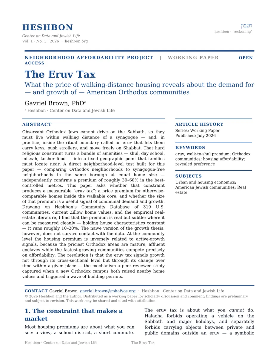
First page of the whitepaper The Eruv Tax

Request the full whitepaper

Tell me who you are and where you work. I’ll send the complete paper.

Sent to the author directly. No list, no forwarding, no third parties.