The paper behind this story
The Safe-City Myth
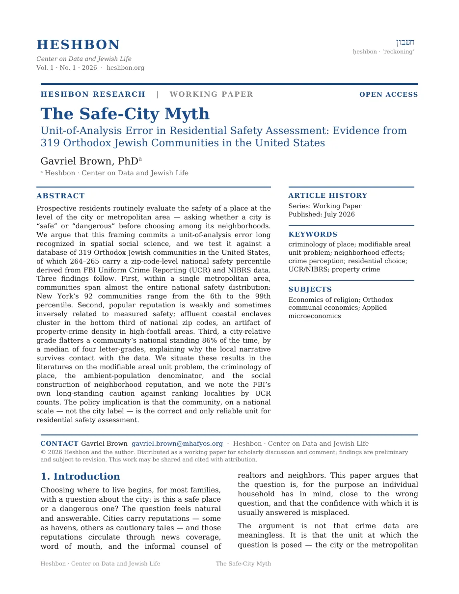
Request the full whitepaper
Tell me who you are and where you work. I’ll send the complete paper.
Sent to the author directly. No list, no forwarding, no third parties.
Everyone carries a mental map of safe and unsafe cities. So we took the national crime percentile of 264 Orthodox communities, each one ranked against every zip code in the country, and held the mental map up against it. For a family choosing where to live, that map turns out to be close to useless.
The bar below covers a single metro, New York. Its left end is the lowest-ranked of the metro's 92 Orthodox communities and its right end is the highest, on a scale where the 0th percentile means more reported crime than almost any zip code in America and the 100th means less. Red is the bottom of that range, blue the top. Watch how much of the country one metro manages to cover.
Two facts break the safe-city instinct in half.
Within a single metro, communities span nearly the whole national safety range. In the New York metro alone, communities run from the 6th percentile to the 99th. The metro's name on the map tells you almost nothing about where any one community lands.
Reputation inverts about as often as it holds. The glamorous, "obviously safe" enclaves cluster below the median U.S. zip code. Several "gritty" Rust Belt communities rank in the country's top third.
"We live in the safe part of town" is usually true. "We live in a safe place" often is not. They are two different sentences.
If several Orthodox communities share a metro, do they land anywhere near each other?
"Is this city safe?" has no answer. When several Orthodox communities share a metro, they scatter across the national percentile range, often almost end to end.
Each row in the chart below is one metro with four or more Orthodox communities in it. The bar runs from that metro's lowest-ranked community to its highest, on the same 0th to 100th national scale, so a longer bar means the metro holds a wider spread of places, and further right means safer. The black diamond sitting on each bar is that metro's median community. The dashed vertical line down the middle is the 50th percentile, the median U.S. zip code. Each bar takes its color from its two ends: red where a community falls below that line, blue where it rises above it.
Notice how many of these bars cross the dashed line and keep going.
Does a city's reputation at least point in the right direction?
Sort communities by popular reputation, the glamorous coastal enclaves everyone knows are safe against the Rust Belt cities everyone knows are rough, and the national percentiles will not line up. One assumption fails reliably: affluence does not buy national safety. Dense, wealthy, high-traffic districts generate a lot of reported crime.
The chart below puts twelve communities on one scale in two labeled groups. Each dot is one community, placed at its own national percentile, and the scale runs the same way as the last chart: right is safer. The dashed line at the 50th is the median U.S. zip code. A dot to the left of that line is drawn red, a dot to the right of it blue. The label on the left tells you the reputation. The dot tells you the number.
Look at which group ended up on which side of the dashed line.
Beverly Hills sits in the bottom 6% of U.S. zip codes for reported crime. Schenectady sits in the top 14%.
Then why is everyone so sure their own neighborhood is fine?
Every community carries two safety readings. A city-relative grade is a letter for how it compares with the rest of its own metro. A national percentile is a rank against every zip code in the country. The first answers "is this a nice part of town?" The second answers "is this a safe place, period?" They routinely disagree, and the gap runs one way.
The three cards below size that disagreement. The local grade is the rosier of the two readings 86% of the time, which is about six communities in every seven.
That gap does its heaviest work on the "obviously safe" enclaves. Their local reputation says very safe. Their national standing says the opposite.
Each of those six communities gets one row below. The hollow dashed circle pinned near the right-hand end of every row is where reputation puts the place, a stand-in for the word "safe" rather than a measured number. The solid red dot is where the community actually ranks against every U.S. zip code. The orange line joining them is the distance between the two answers, so a longer line means a wider gap. The dashed vertical line at the 50th percentile is the median U.S. zip.
Follow each line from the hollow circle to the red dot and watch how far it has to travel.
What happens to the same 36 places when you change which yardstick colors them?
Here are 36 communities across the country, each with a real CrimeGrade national percentile. The two buttons above the map choose which crime yardstick colors the dots, and the two rarely agree.
Both scales are built on the same federal source: the FBI's national crime databases, the Uniform Crime Reporting (UCR) program and the National Incident-Based Reporting System (NIBRS), supplemented by direct reports from state and local police. CrimeGrade and DoorProfit both start from that FBI data. They just frame it differently (one against the whole country, one against the local metro), which is exactly why the two lenses can disagree about the same place.
Every dot on the map is one community, sitting at its own location. In the national view the color runs from deep red at the bottom of the country, through pale shades in the middle, to deep blue at the top, and the turn from red to blue is the median U.S. zip. In the local view there are only two colors, both green: dark green for a community graded A inside its own metro, pale green for a B.
Press one button, then the other, and watch the red disappear.
So: does the city tell you whether the neighborhood is safe?
No, and it points the wrong way about as often as the right way. The city-level label is the wrong unit of analysis, and within a single metro the safety of individual communities ranges from the bottom of the country to the top.
The only reliable read is the specific community on a national scale. With the property-crime caveat below firmly in mind, that is the one number worth checking before anyone concludes a place is safe or unsafe.
Two cards close the ledger. The left one is the middle community of all 264, the one with as many communities above it as below. The right one is the share of those 264 that fall below the median U.S. zip code.
Both scales rest on the same federal foundation: the FBI's national crime databases, the Uniform Crime Reporting (UCR) program and the National Incident-Based Reporting System (NIBRS), supplemented by direct reports from state and local law enforcement. CrimeGrade builds its national percentile on that FBI data; DoorProfit calibrates its A–F local grades to FBI UCR national averages (total crime ≈ 2,213 per 100k, violent ≈ 381, property ≈ 1,832). The two verdicts differ because each frames the same FBI numbers against a different yardstick, the whole country versus the local metro, and never because the underlying crime counts differ. Because the FBI's UCR is a voluntary program with reporting gaps, both providers backfill with state and local agency data.
The national percentile is CrimeGrade's zip-level score, weighted heavily toward total (largely property) crime. Read it as overall reported-crime density rather than as a violent-crime index. Dense, wealthy, high-footfall areas (luxury shopping districts, tourist zones) post high reported counts and therefore low percentiles even where violent crime is moderate. Some of the single-digit scores for affluent enclaves reflect that, and not street-level danger.
Both instruments draw on the same FBI crime data (UCR / NIBRS); they differ only in how they score it. The national percentile (CrimeGrade) ranks a place against every U.S. zip code; the city-relative grade (DoorProfit) grades it against its own metro. This essay uses the national percentile as the comparable yardstick and treats the city-relative grade as the local narrative.
Figures are keyed to each community's most common zip code, which can span several miles rather than the specific blocks around a given shul. National percentiles exist for 264 of 319 communities; the within-metro analysis uses metros with four or more communities.
The "posh" and "gritty" lists are hand-selected to represent common perceptions, not a random sample. They demonstrate that reputation is unreliable. They are not a precise effect size.
The paper behind this story
Tell me who you are and where you work. I’ll send the complete paper.
Sent to the author directly. No list, no forwarding, no third parties.