ḤeshbonCenter on Data and Jewish Life Sources Explore the data
Seasons
Topic

Ḥeshbon · חשבון · an accounting

How Jewish life gets paid for.
Measured, not assumed.

The community argues from experience. We test those arguments against tax filings, benchmarking panels and price data. The work comes in seasons. Each season takes one domain and stays there.

3 seasons 8 data stories 2 interactive tools 887 institutions in the panel

Every figure has a named source. Sample sizes and limits are stated on the page.

Season 1 · Complete

Jewish Education

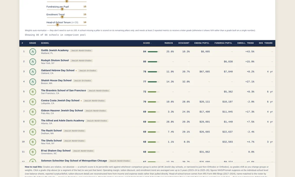
What schools spend, charge and raise — and who is actually at risk. Ten pieces, built on tax filings and national benchmarking panels.

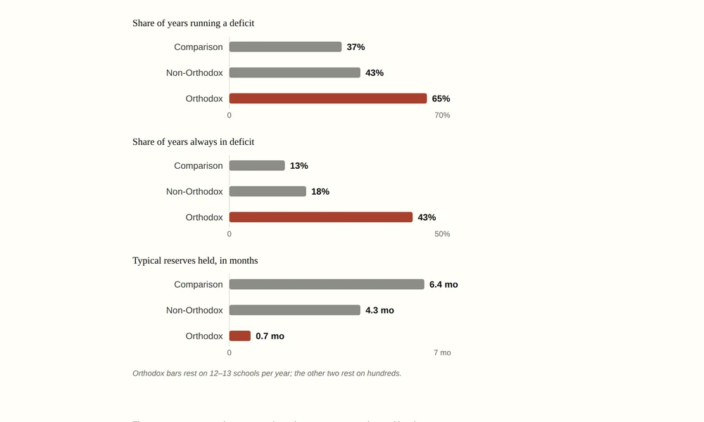
Three bar panels comparing deficit rates, persistent deficits and reserve months across comparison, non-Orthodox and Orthodox schools
Financial Risk · 3 min readWhite paper

Who is actually in financial trouble. It isn't the schools that close.

Most private schools run short before fundraising. That is what fundraising is for. The real question is who runs short after it. Comparison schools do in 37% of years. Orthodox day schools do in 65% — and they hold 0.7 months of reserves, against a comparison median of 6.4.

65%of Orthodox school-years
run a deficit
Bar chart of six financial measures versus comparable private schools, fundraising per student far ahead at +161%
Cost & Financing · 5 min readWhite paper

The premium is real. It is just not in the price.

Everyone assumes families pay for the second curriculum. They do not. Net tuition is flat across 887 schools. The premium lands on philanthropy.

+161%fundraising
per student
Two cost curves crossing: comparison schools rise after 150 students while Jewish day schools keep falling
Cost & Scale · 6 min readWhite paper

Growing usually stops saving money. Not here.

Most independent schools stop saving money past about 150 students. Jewish day schools keep saving well beyond it. That makes growth a cost strategy here, and almost nowhere else.

600+students, where these
schools still save
Line chart of annual tuition growth against consumer price inflation, 2017 to 2026
Tuition & Inflation · 3 min read

Schools raise tuition about 4% a year. Inflation does the rest.

Inflation swung across 8.4 points. Tuition growth stayed inside 1.5. It never tracked inflation. Two large misses happened to cancel.

1.5 ptstotal range of tuition
growth, nine years
Chart showing endowment wealth concentrated in a handful of schools across the 90-school sample
Endowment & Aid · 6 min read

A few schools hold most of the money. That isn't the problem.

Five schools hold 40% of the endowment. That looks like the problem. The filings say it is not. The real divide is having a cushion at all.

40%of endowment held
by five schools
Chart of endowment concentration across 90 schools, top five holding 39.1 percent
Endowment & Aid · 3 min read

The wealthiest schools are not the most generous.

Endowment is heavily concentrated. Tuition assistance is not. The schools with the least wealth give the largest share of revenue to families.

39.1%of $484.7M held
by the top five
Chart comparing executive compensation growth against consumer price and private wage benchmarks
Leadership Pay · 3 min read

The fastest-growing schools pay their leaders the least.

Pay theory says pay follows growth. Here it did the opposite. Orthodox and Chareidi schools grew revenue fastest and pay slowest. Real pay fell.

8% / 1%revenue growth vs.
pay growth, per year
Chart ranking predictors of head-of-school compensation, revenue far above tuition
Leadership Pay · 3 min read

Boards benchmark against tuition. Tuition barely matters.

Revenue predicts head-of-school pay at r = 0.60. Tuition manages 0.15. Across 134 heads, boards are anchoring on the wrong number.

r = 0.15tuition's correlation
with head-of-school pay
Season 1 · Interactive

Tools

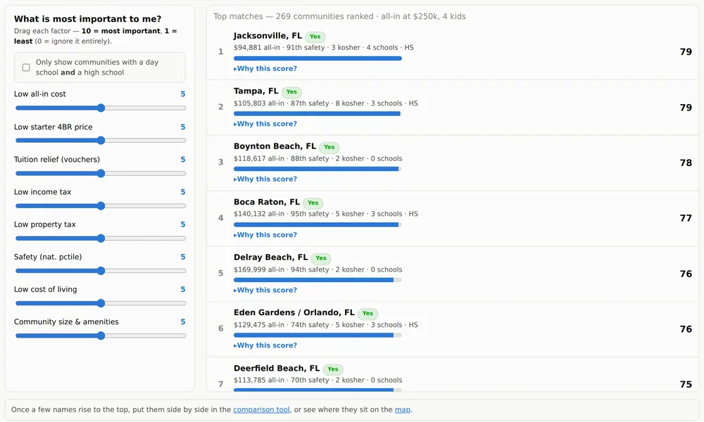
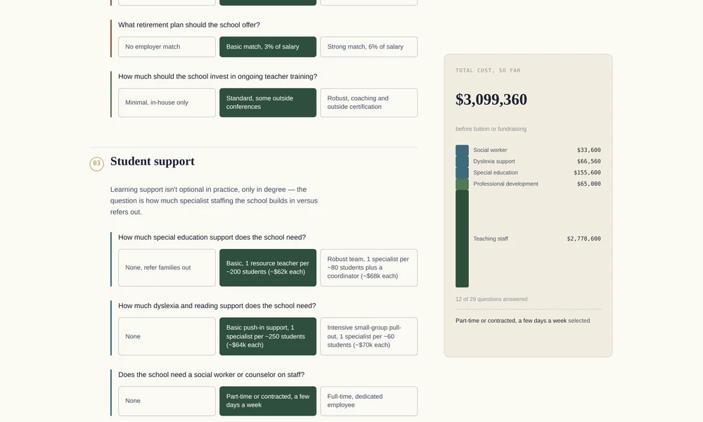
Move the inputs. Watch the numbers change.

Season 2 · In development

Household Affordability

Season 1 measured institutions. Season 2 measures households. Not what a school charges — what a family actually pays, across all of it.

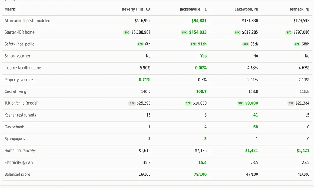
The premise. Institutions and households keep different books. A school can hold tuition flat and still price a family out. Tuition is one line. Camp, dues, food and housing are the rest. Season 1 saw the first line. Season 2 adds them up — and looks for the families who left before anyone counted them.

Planned · Data story

The cost of a Jewish year

A family of four, priced line by line, across several communities. School, camp, dues, food, housing. No anecdotes.

What does participation actually cost, all in?

Planned · Data story

The band that doesn't qualify

Aid formulas are built around need. Some families earn too much to qualify and too little to pay. How wide is that band now?

Where does the squeeze actually bite?

Planned · Data story

Who leaves, and when

Attrition gets explained after the fact. This traces where families actually exit, and tests whether price predicts it.

Is the exit financial, or is that the story we tell?

Planned · Interactive

Household ledger

Build a school, from the family side of the table. Enter a household. See the annual cost, and what share of income it takes.

What would this cost us?

Season 3 · Planned

Federation & Charitable Giving

Where communal money comes from. Who decides where it goes. And how much has moved away from federated campaigns.

The premise. Seasons 1 and 2 end in the same place: philanthropy closes the gap. Season 3 looks at the philanthropy. The campaign, the family foundation, the donor-advised fund. Allocation decisions are in the record. This reads them.

Planned · Data story

What happened to the campaign

Twenty years of campaign revenue, in real terms and per household. Set against the giving that routes around federations entirely.

Is the money gone, or just moving differently?

Planned · Data story

Where the allocations land

Education, social services, Israel, overseas. Stated priorities against what the filings actually distribute.

Do the allocations match the rhetoric?

Planned · Data story

The rise of the intermediary

Donor-advised funds and family foundations now sit between donors and institutions. That layer changes timing, concentration, and who gets to ask.

Who decides now?

Planned · Data story

The +161%, from the giving side

Day schools raise two and a half times what comparable schools do. Who are those donors? How few of them are there?

How many people is the sector standing on?

Season 1

The panel behind the papers

One dataset underpins nearly every Season 1 story.

887
private schools in the national comparison pool
2,059
school-years observed, 2022–2026
$484.7M
endowment assets across 90 reporting schools
134
heads of school identified in 990 filings